Graphic charter (brand guidelines): definition, elements and best practices
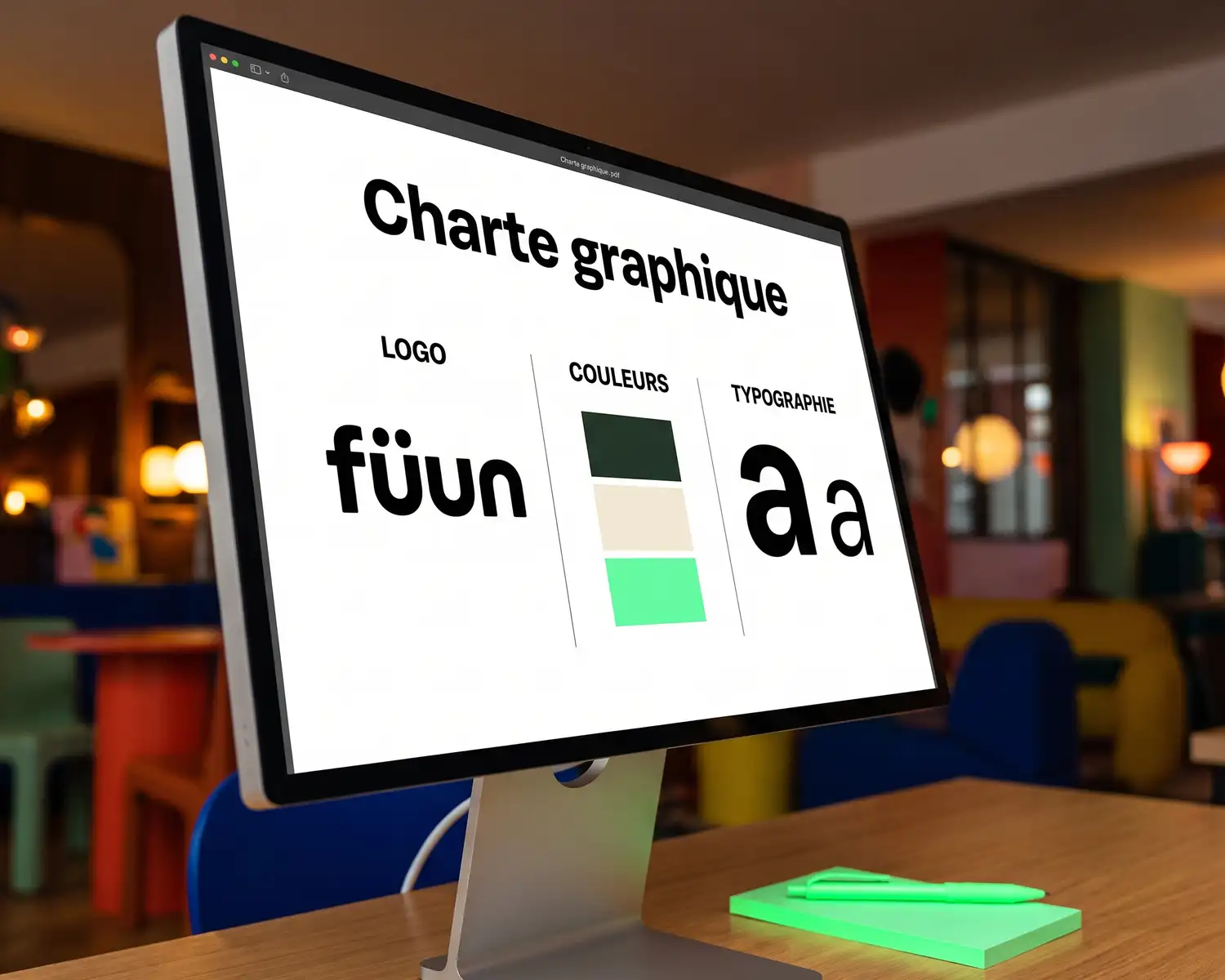
A graphic charter is the document that sets a brand's visual identity, whether for a company, an association, or an employer brand: the logo and its variations, a color palette with exact codes, one or more typefaces, and usage rules. It keeps the look consistent everywhere the brand shows up, from a website to a personalized garment worn by a whole team.
The essentials in 4 points:
- A graphic charter brings together the logo, the color palette (exact codes), typefaces, and usage rules.
- It keeps the look identical everywhere, including when several people or suppliers use it.
- For dressing a team, two points matter more than the rest: the number of colors chosen and the logo file format.
- No formal charter yet? Four minimum elements are enough to get started (see below).
What is a graphic charter, exactly?
A graphic charter is not a logo, and it's not a simple color swatch sheet either. It's a document (often a PDF a few pages long) that gathers all of a brand's visual rules and explains how to apply them. The goal: that two different people, with the same charter in hand, produce a visually identical result.
It's distinct from two neighboring ideas. Visual identity is the concrete result (the logo, the colors, the style); the graphic charter is the document that describes and frames it. The English term "brand guidelines" generally covers the same thing, sometimes broadened to tone of voice and photo style.
The elements that make up a graphic charter
| Element | What it specifies |
|---|---|
| Logo and variations | main version, simplified version or monogram, clear space, minimum sizes |
| Color palette | exact codes (Pantone, CMYK, RGB, hex), primary color and secondary colors |
| Typefaces | heading font, body text font, size hierarchy |
| Usage rules | what's forbidden: stretching the logo, changing its colors, placing it on a background that breaks its readability |
| Tone and world (optional) | brand vocabulary, visual mood, photo style |
The first three rows of the table are non-negotiable. The last two vary a lot depending on the size of the organization: an association or a small club often skips them, a company or a brand tends to formalize them further.
Graphic charter and merch: what actually matters for dressing a team
A charter designed for a website or a brochure doesn't always work for merch. Two points deserve particular attention before placing an order.
The number of colors chosen in the charter. Every color has a cost once it moves from file to needle or ink: the more there are, the more the textile rendering gets complicated, and the higher the bill climbs. A charter with 2 or 3 solid colors works almost everywhere without compromise; a charter with 6 or 8 colors often requires simplifying the logo for textile, something to plan for rather than discover when the quote arrives.
The logo file format. A complete graphic charter usually specifies the logo format (vector, ideally AI, EPS, SVG, or a vectorized PDF), but not always, especially for an association or a club without a designer on hand. The format that actually works for textile printing covers the topic in full, with a free fix if your only file is a JPG or a PNG.
Exact color codes plus a vector file together mean the same garment produces an identical result from one order to the next, even months later.
The mistakes that get expensive when ordering merch
- No color coded precisely. Without an exact code (Pantone or hex), each supplier interprets the shade their own way: the cap's blue no longer quite matches the sweatshirt's blue.
- Too many colors in the logo. A logo designed for a screen, where colors cost nothing, runs into the real budget of textile marking.
- No written usage rule. Without a clear ban, the logo ends up stretched, recolored, or placed on an unreadable background as orders pile up and different people handle it.
No formal graphic charter? The 4 minimum elements before ordering merch
Many associations, clubs, and small organizations have never written a complete graphic charter. Before a first merch order, four elements are enough to avoid most of the bad surprises:
- A vector logo file (or a high-definition version to have converted).
- One or two main colors, with their exact code if possible.
- A simplified version of the logo, without gradients or overly fine detail.
- An example of what never to do (a stretched logo, badly recolored).
What TKNP does for you
Your graphic charter isn't formalized yet, or you're not sure what's really needed for textile? On your TKNP Store, the studio handles the rendering of your logo on every product: no need to master every technical detail of a professional graphic charter to launch a coherent collection.
Frequently asked questions
What's the difference between a graphic charter and a logo?
A logo is a single visual element. A graphic charter is the broader document that brings together the logo, its variations, the color palette, the typefaces, and the usage rules that guarantee a consistent look everywhere.
Do you need a complete graphic charter to order merch?
No. A formalized charter helps, but it isn't essential to get started. A vector logo file, one or two main colors, and a clear rule about what not to do are enough for a consistent first order.
How many colors should a graphic charter contain?
There's no universal rule for a graphic charter in general, but for merch, 2 or 3 solid colors remain the simplest choice to apply to a garment without raising the price or complicating the marking.
What software should I use to create a graphic charter?
Vector design software (Illustrator and equivalents) is the most commonly used to build a professional graphic charter. For an organization with no design budget, a simple template with the 4 minimum elements (logo, colors, simplified version, bans) is enough to get started.
My graphic charter didn't plan for a textile version of the logo, what should I do?
That's common: many charters are designed for a screen or a printed support, not a garment. The point to check first is the file format (vector, ideally); the guide on the logo format for textile printing details how to fix it, including for free if needed.
Your project, quoted within 24 hours.
Describe your garments, your decoration and your quantities: you receive a detailed quote, decoration included, within one business day.