Clothing brand logo: which type should you choose?
For a clothing brand, the best logo is the one that stays legible once embroidered on the chest, a few centimetres wide, and still has impact printed large on the back. The six main types of logo do not have the same strengths on fabric: a monogram or a simple symbol shine small, a mascot or a detailed emblem come into their own at large size.
On a screen, every logo looks fine. On a custom sweatshirt, cap or t-shirt, fine details disappear and colours cost money. Here is each type of logo judged from that angle.
The 6 types of logo for a clothing brand
| Type of logo | What it is | Embroidered on the chest | Printed on the back |
|---|---|---|---|
| Wordmark | the brand name set in a typeface | good, if the letters stay tall enough | very good |
| Monogram | the initials, often interlaced | very good | good, a little bare at large size |
| Symbol (pictogram) | a drawing on its own, with no text | very good if the shapes are simple | very good |
| Emblem | text enclosed in a badge or crest | needs simplifying, or a patch | very good |
| Combination mark | a symbol and a name, usable together or separately | very good, in the short version | very good, in the full version |
| Mascot | an illustrated character | difficult at small size | very good in print |
The wordmark: the name, legible everywhere
A wordmark spells out the brand name in a chosen typeface, with no drawing. It is clear and instantly recognisable, as long as the letters stay legible once reduced: in embroidery, text under 5 mm tall loses legibility.
A short name works very well on the chest of a t-shirt; a long name reads better large on the back or on a sleeve.
The monogram: initials made for small sizes
A monogram reduces the brand to its initials, often interlaced. It is the most compact type: it fits into a small space without losing its shape, which makes it an excellent candidate for chest or cap embroidery. At large size, it benefits from being paired with the full name.
The symbol: a shape people recognise without reading
A symbol, or pictogram, is a drawing on its own that ends up standing for the brand without a single word. On a garment, that is a rare asset: it reads from a distance, in every language, at every size. For embroidery, keep solid shapes and avoid gradients, which thread cannot reproduce.
The emblem: a rich badge, to simplify for thread
An emblem encloses the brand name in a shape, badge, crest or patch, often with small elements around it. It has a premium, collegiate feel, but its fine details and small text suffer in direct embroidery.
Two solutions: plan it large on the back, or turn it into a patch, an embroidered badge sewn onto the garment. On tknp.io product pages, the patch is one of the techniques offered, on quotation.
The combination mark: the most flexible for a clothing brand
A combination mark pairs a symbol with a name, which can be used together or separately. It is the most practical type for a clothing brand: the symbol alone on the chest, the full version on the back, the name alone on a label. One identity can then run across a whole merch collection without ever being forced.
The mascot: a character made for large formats
A mascot is an illustrated character that embodies the brand. It builds attachment and suits playful designs, but its colours and details need space: it comes fully alive printed on the back, much less in small embroidery.
One logo, two versions: the golden rule on fabric
Whatever type you choose, the right reflex is to plan two versions of your logo: a simplified version for small embroidered formats, and a full version for large designs. On tknp.io product pages, the reference embroidery measures 8 × 10 cm, whereas a back print can go up to around 28 cm wide.
The more complex the logo, the more the print costs
A busy logo is paid for at order time: the more colours, details and small elements it has, the more expensive its print or embroidery, whatever the technique. A simple logo costs less and works everywhere.
The advice that works for everyone: go monochrome
Whatever your project, brand, association, club or company, try your logo in a single colour. Many people are surprised by the result: a well-placed monochrome logo looks higher quality than a multicolour version, and it costs less to print.
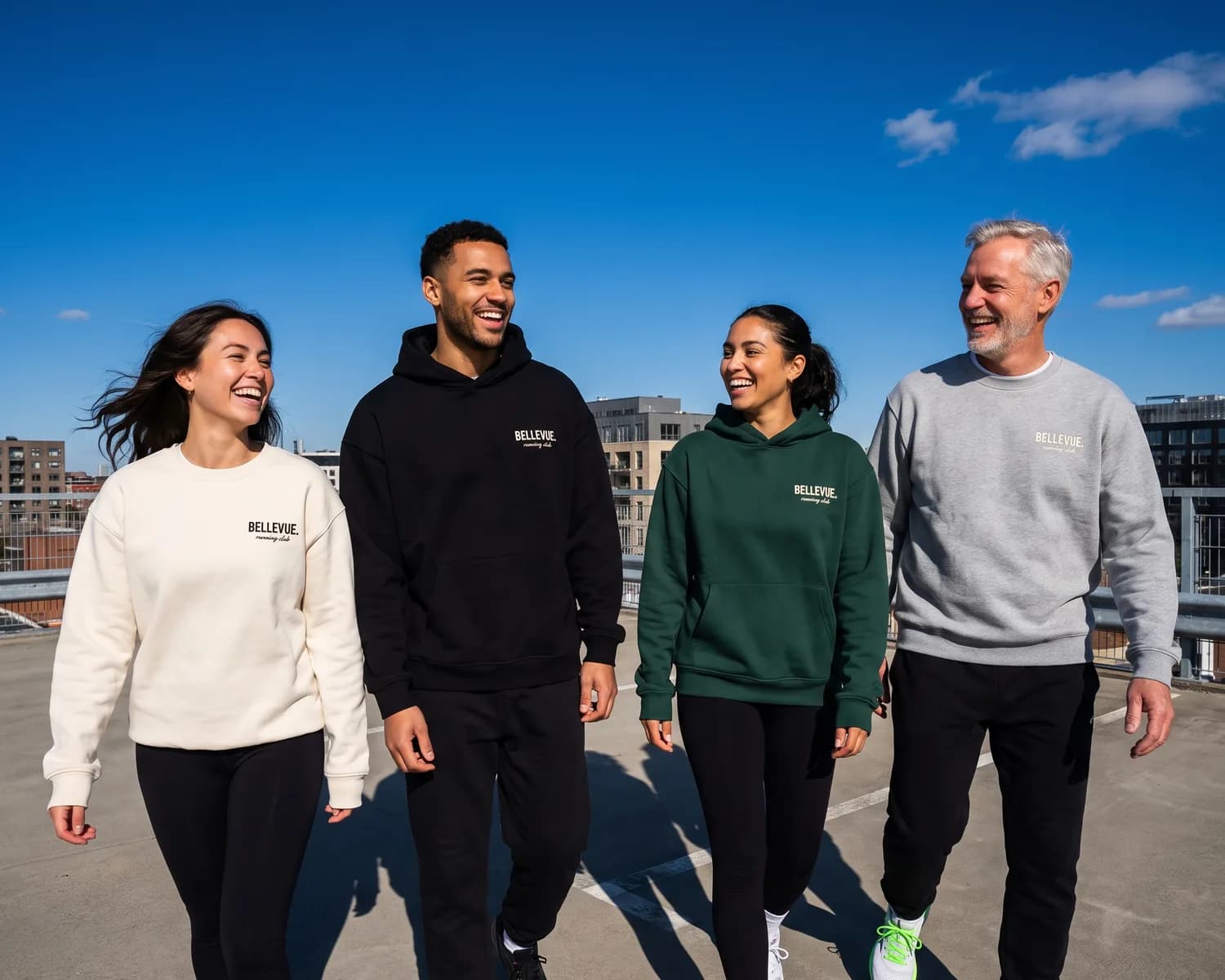
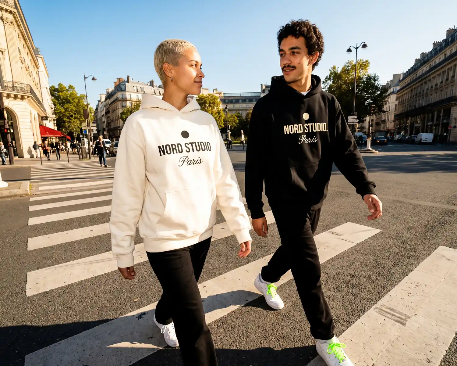
The real play then comes from alternating garment and logo: an ecru sweatshirt with a black logo, a black sweatshirt with an ecru logo. One logo, two colours that answer each other, and a whole collection takes on a coherent look. The detail by technique is in our article on logo formats.
To set those colours once and for all, our article on brand guidelines explains how the logo's variations are organised.
Preparing your logo file
Once the type is chosen, you still need to supply a clean file. Vector is ideal, but you don't need to have one: the tknp.io designer handles the vectorisation for you, from a high-definition PNG. Our article on the right file format and our guide to preparing your logo for print and embroidery detail what each technique expects.
See your logo on a garment before deciding
Hesitating between two versions of a logo can be settled in a few minutes: place them one after the other in the tknp.io designer, on a t-shirt or sweatshirt from the catalogue, and judge the result on the chest and on the back, free of charge. If you are just starting out, the six launch steps we describe put this choice in its place within the project.
Key takeaways
- Six types of logo: wordmark, monogram, symbol, emblem, combination mark, mascot.
- At small size and in embroidery, simple shapes win: monogram, symbol, short version of a combination mark.
- Plan two versions, a simplified one for the chest and a full one for the back.
- The more complex the logo, the more the print costs: try it in monochrome, alternating ecru and black between garment and logo.
Frequently asked questions
What is the best type of logo for a clothing brand?
The combination mark is the most flexible: its symbol alone works embroidered on the chest, its full version printed on the back. A monogram or a simple symbol also work very well if the brand mostly aims for small formats.
Can a detailed logo be embroidered?
Yes, provided it is simplified: embroidery cannot render gradients, and text under 5 mm tall loses legibility. A very detailed logo is better suited to print, or to an embroidered patch.
Do you need a different logo for embroidery and for print?
Ideally, yes: a simplified version for chest embroidery, with no small text or gradients, and a full version for large back prints. Both remain the same logo, adapted to each use.
Your project, quoted within 24 hours.
Describe your garments, your decoration and your quantities: you receive a detailed quote, decoration included, within one business day.