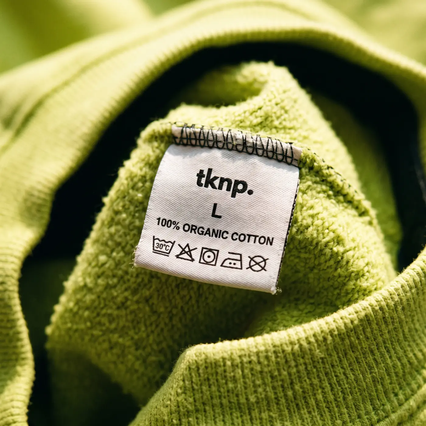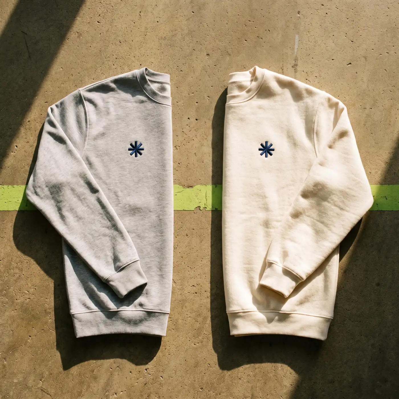
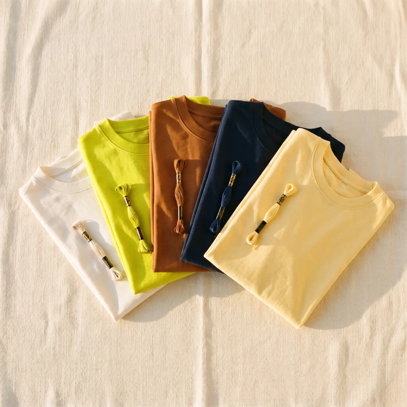
The 5 trend colors of fall-winter 2026 for custom apparel: Cloud Dancer (the off-white Pantone Color of the Year), wasabi green, warm browns, ink blue and butter yellow. The smart move: wear them as a printing color, thread or ink, on a classic garment.
The essentials in 4 points:
- The 5 colors come from the leading sources of fashion trends: Pantone (Cloud Dancer, reference 11-4201), the 2026 Pinterest Palette (Wasabi #E9F056), Dulux (deep blues) and the fashion press.
- The trend plays out first in the printing: you choose the thread or ink color freely, and the garment color from the catalog's colorways (Stanley/Stella offers dozens).
- The rule of a coherent collection: one base color, one character color, one accent, and the logo keeps the same ink everywhere.
- On a Store, the winter limited edition costs nothing: one more seasonal colorway, and sales decide.
Every season, the same question when building a collection: what are the 2026 trend colors, and which ones should you pick so the merch looks like today, not three years ago? The good news: the fall-winter 2026 colors are particularly easy to wear, and they suit custom apparel very well.
One method note before we start, because it changes everything: the trend plays out first in the printing. The color of the embroidery thread or the printing ink, you choose freely, down to the exact color code. The garment color is chosen among the colorways of the catalog's brands, and that works out well: Stanley/Stella offers its references in dozens of colorways, with close cousins of every color of this season. So for each color, I give you both readings: as a print, and as a background.
Where these 2026 trend colors come from (not out of our hat)
A color trend is not invented, it is observed. The 5 colors in this selection come from the sources the whole industry watches: Pantone, which made Cloud Dancer its Color of the Year 2026, the 2026 Pinterest Palette, built on what millions of people actually pin, the family of blues named color of the year by Dulux, and the palettes showing up everywhere in the fashion and design press this year, from warm browns to butter yellow.
Our job here: sort out what works on a worn garment, and turn it into concrete decisions.
1. Cloud Dancer: the off-white that replaces white
Pantone's Color of the Year 2026 (official reference PANTONE 11-4201): a soft off-white, neither cream nor grey, that warms everything it touches. On textile, it is the simplest color of the season: it suits everyone, it makes the cotton visible (the grain of the fabric reads better than on optical white) and it ages better than pure white.
As a print: the tone-on-tone of winter. An off-white embroidery on an ecru or beige background is maximum premium effect for a discreet logo. And on a dark background (navy, brown), a cloud dancer logo is softer and more fashionable than pure white. As a background: the easiest of the list: ecru and naturals exist at Stanley/Stella across almost every reference. The ecru hoodie or crewneck is THE base of the winter range, whatever your community.
2. Wasabi: the acid green of the year
Highlighted by the 2026 Pinterest Palette (official code #E9F056), wasabi is an acid, luminous green, between lime and chartreuse. It is the green of the year: energetic, young, impossible to miss among winter's blacks and greys.
As a print: this is where it shines. A wasabi embroidery thread or ink on a dark background (navy, black, brown), and the most classic garment becomes the most noticed of the season. The perfect dose of boldness: the background stays sober, the logo does the work. As a background: for communities that own it (creators, young brands, clubs that want to be seen). Look for the vivid greens in the Stanley/Stella color chart for the closest cousin, and keep the printing cream or black.
3. Warm browns: the retro that looks vintage from day one
Sienna, chocolate, iced brown, kombucha: the brown family is everywhere in the 2026 palettes, and it is the most natural of autumn. Brown has a superpower on merch: it instantly evokes American vintage, the university sweatshirt you seem to have owned for twenty years. A warm brown collection looks like it has a history, even on launch day.
As a print: brown is a beautiful, underused ink color: a warm brown lockup on an ecru or beige background replaces black with much more warmth, instant heritage feel. The Pinterest Palette even pushes it to Cassis (#351E28), a deep brown-burgundy that is superb as embroidery thread. As a background: the brown crewneck with a cream or orange retro lockup. Browns and chocolates exist in the Stanley/Stella color chart: ideal for associations, clubs playing the "since forever" card, places and souvenir shops.
4. Ink blue: the deep one that replaces black
Dulux made deep blues its color of the year 2026 (Eclipse, Vintage Blue, Ink Blue), and fashion is on the same path: deep indigo is settling in wherever black used to reign. On textile, ink blue has all of black's advantages (it flatters, it endures, it goes with everything) with extra character, and it shows off an embroidery magnificently.
As a print: ink blue on a light background (ecru, cloud dancer) is the chic alternative to black: softer, more dressed, it gives typographic lockups a luxury-stationery feel. As a background: the safe bet of the collection, the one everyone buys, and the easiest colorway to find: navy and deep blues are a pillar of the Stanley/Stella color chart. A deep blue hoodie or polo, white or ecru embroidery on the chest: the combo that works for companies, clubs, and everyone who wants serious without sad.
5. Butter yellow: the touch of light
The soft, powdery, almost-butter yellow is the surprise of 2026: spotted on the runways in spring, it is settling into winter palettes as THE accent color. In the middle of January, a butter yellow among dark coats is a smile.
As a print: its best life. A butter yellow logo on a navy or brown hoodie is THE touch of light of the winter, at the cost of a simple ink choice. The perfect example of risk-free trend: the garment stays classic, the logo is in season. As a background: in small doses. The beanie, the tote bag or the collection's t-shirt, in the closest soft yellow of the color chart. It is the color that gets people talking ("where is that beanie from?"), not the one that carries the whole range.
The winter limited edition: the trend at the cost of an ink choice
You have seen it: across the 5 colors, the printing reading is almost always the smartest. It has one more virtue when your brand guidelines lock the logo colors: keep your identity on the main version of the collection, and release ONE seasonal colorway where the logo switches to a color of the year. That is exactly what a winter limited edition is, and on a Store it costs nothing to create: no stock, no bet, just one more variant.
And on the background side, you have room: the catalog's brands go wide, Stanley/Stella first, whose references exist in dozens of colorways. Enough to find the ecru, the green or the deep blue that answers your logo, directly on the product pages of the sweats and hoodies section.
How to combine them without getting it wrong
The strength of this 2026 palette: these 5 colors work together. A few simple rules for a coherent collection:
- One base color, one character color, one accent color. For example: ink blue as the base, cloud dancer for softness, butter yellow as the accent on accessories. Three colors maximum per collection: beyond that, the range loses its thread.
- The logo keeps the same ink everywhere. A cream logo on ink blue, brown and wasabi: three different garments, a single identity, and guaranteed legibility on every shade. That is what makes a collection look like a brand.
- Think about what gets worn TOGETHER. Your community will see two members side by side: a wasabi hoodie next to an ecru crewneck works; two colors screaming at each other, no.
And if your community disagrees?
That is the real advantage of a Store: you do not have to bet the whole collection on one color. Offer the same garment in two colorways, the trend shade and the safe bet, and let the orders decide. The trend gets the clicks, the sales tell the truth. And in spring, we do it again: the colors change, the method stays.
Frequently asked questions
What is the Pantone Color of the Year 2026?
Cloud Dancer, reference PANTONE 11-4201: a soft, airy off-white. Pantone presents it as a versatile foundational color, which makes it an excellent main color for a custom apparel collection.
What are the colors of the 2026 Pinterest Palette?
The 2026 Pinterest Palette has five colors: Cool Blue (#D7EFFF), Sage Green (#AEB8A0), Cassis (#351E28), Wasabi (#E9F056) and Topaz Orange (#FF5C34). It is built on what the platform's users actually pin, not on studio forecasts.
What colors for a hoodie in 2026?
The season's safe bets: ecru (cloud dancer) and deep blue as the garment color, with a cream, warm brown or wasabi print depending on the character you want. Warm brown is the rising alternative for a vintage feel.
Do trend colors go out of fashion quickly?
An accent color, yes: that is its role, it marks a season. That is why the safest method is to wear the trend in the printing or on accessories, and keep the main garments in lasting shades (ecru, navy, brown).
What logo color on a black or navy garment?
Cream and off-white remain the most legible. For a 2026 look, wasabi and butter yellow work very well as an accent on a dark background: the garment stays sober, the logo brings the color of the season.
Your organization deserves its official store.
Create, buy and sell premium merch — the account is free, the store opens when you're ready.